As the Director of Curatorial Affairs at the Museum of Pop Culture in Seattle, Jacob McMurray definitely knows a thing or two about concert posters. He’s curated shows focused on the artform multiple times (like PUSH ME, PULL ME: Pearl Jam and the Art of the Screen Printed Poster) and had a previous life running a screenprinting shop. In short, he’s got an insider’s perspective twofold. Hence this interview…
Q: Over the years, you’ve acquired literally thousands of posters for MoPOP. Were there any you remember being particularly surprised at tracking down or discovering?
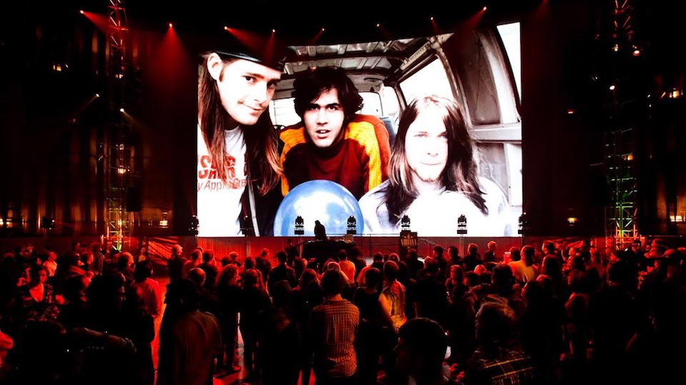
A: We had a few people collecting material for the collection in the early days. Back in the mid-to-late 1990s, I was a curatorial assistant and I was mostly helping the curators at the time with their collecting strategies. After a while I started working with the local Seattle record stores, who would save every poster that bands brought in and then donate them to us. I also had deals with a couple screenprinters in town that would save copies of jobs they would print. I would also work directly with collectors and acquire pieces that way as well. Various ways. As a transplant to Seattle (starting in 1990), I always was enamored with the mythology of Pacific Northwest music – particularly the punk and pre-‘grunge’ material. Today you can find any number of books or websites or reissues about these bands, but back in the later 1990s, bands like the U-Men or Feast or Student Nurse or The Beakers felt like weird, mythic lore, so it was cool for me to start recognizing these bands on posters and start recognizing particular artists. So for me, getting back to your question, I always loved finding posters that I hadn’t seen before, by artists like I liked. One was Helena Rogers, who was the lead singer and guitarist for Student Nurse, and she did these cool, super-DIY screenprinted flyers for her band. They were all really striking because the bulk of the posters you’d see from the early 80s were pretty crude, but hers were really a different beast. One of my still favorite posters that I acquired was a poster Kurt Cobain made for Nirvana at the Community World Theatre in Tacoma on March 19, 1988 – the first show where they were actually called Nirvana (they had several different names before taking up the moniker). That was from a collector in Olympia and it was just in the stash of stuff she brought when we met. Again, at the time, there were no internet gigposter sites or fan sites where you could look up all Nirvana posters or whatever band you were looking for, so each new discovery was like a new world to me. It was all very mysterious in a way that it really can’t be anymore. At least for most bands.
Related: “MoPOP Knows How to Rock”
Q: You actually had a screen-printing shop yourself at one point. How did you go about drumming up work for your business within the music scene?
A: I had a screenprinting shop called Patent Pending Press, with designer Jeff Kleinsmith, illustrator Jesse LeDoux, and printer Brian Taylor. For 5ish years we printed a ton of rock posters in Seattle. A lot of jobs were either from posters Jeff and Jesse were designing or from other designers that were our friends, like the Ames Bros, or Mike King, or artists that we had developed good relationships with through poster conventions like Flatstock. Drumming up business wasn’t something we were super great at, honestly, which is part of the reason we died a fiery death! Alas. It was fun while it lasted.
Related: “8 Gen-X Posters Likely to Be On Your Wall Back In the Day”
Q: Previously, you’ve mentioned Jeff Kleinsmith, Mike King, and Art Chantry as among your favorite poster designers. Can you describe one of your favorite posters by each and why you like it so much?
A: Jeff Kleinsmith – there are so many good Kleinsmith posters. He’s an amazing talent and an incredibly modest guy. His work started as a pretty gritty Chantry-inspired cut-and-paste style posters but transitioned in the early 2000s into some of the most sublimely beautiful rock posters that I think I still have ever seen. He is a master at evoking a strong emotion within the tableau of an 18×24 sheet. But let’s go back to his early 11×17 xerox posters from the early 1990s, as these fit squarely within the rock realm and they illustrate his capabilities as a designer to work quickly with a spark of inspiration, a photocopier, a waxer and the desire to do cool shit. I don’t have a particular favorite but look at any of these early posters, with a central evocative image and a ton of just-so placed manipulated type. SO GOOD.

Mike King – what I love most about Mike King is that 1) he’s made more posters than maybe anyone ever, and 2) Mike King is fucking funny. He told me once that if you ever run out of ideas you can always put a robot in the poster. And he’s RIGHT. I just really admire Mike for making posters for 40 years with the same amount of humor, style, and DIY aesthetic. I have a poster in my office by Mike that was for an art show where the participants made new book cover designs (in poster form) for some of their favorite books. Mike chose At the Mountains of Madness by HP Lovecraft and made this amazing glow-in-the-dark piece that is tentacular in the extreme. I love it.
Art Chantry – Art deserves all the kudos in the world. He’s influenced countless designers and added a level of sophistication and vision when he began doing punk and new wave flyers in the late 1970s. One of my favorite pieces of his is a poster for the Gang of Four at the Showbox in Seattle in 1981. He took an old Russian stamp, blew it way up and added bombs, type, and other bits, and made an absolute classic. I ended up buying the original paste-up and rubylith separations from him and it’s in the MoPOP permanent collection now. I love that piece.
-CultureSonar
-Photo Credit: Nirvana at MoPOP
0 comments on “The Poster Boy of Rock n’ Roll”