Follow us
The Age of The Great Rock ‘n Roll Logo
The golden age of band logos spanned from the late 60’s through the early 80’s when visual creations served bands in what we call today “branding.” Some say it was an artistic manifestation beyond the music; others accuse their presence as just a clever workaround from traditional advertising.
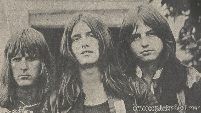
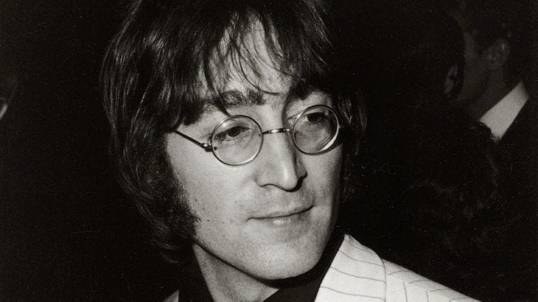
As with so many things, the Beatles would be the fire-starters for the age of band logos. Certainly, their “drop-T” logo would qualify as one of the first great branding images. But as premier Beatles historian Mark Lewisohn has recently pointed out to me, the Beatle’s familiar logo found on Ringo’s bass drum has never been printed on any of their original albums. Therefore, for the purposes of this piece, we will examine the top 10 classic band logos that appear on album covers.

10- Chicago Transit Authority

We all know them as plain old “Chicago” because soon after the release of their first album, the actual Chicago Transit Authority threatened to sue them for copyright violations. The grief the band suffered didn’t stop there; designer John Berg’s creation was accused by the hippie crowd of being nothing more than a gouty logo that the older generation would THINK young people would be attracted to. It had capitalism and an Ivy League approach to its style. But the band stuck to their guns and doubled down on the design, happily augmenting it in various creative ways. Indeed, the logo would find itself stamped in chocolate, supported by a cardinal, carved in wood, and snaked by a garden hose. All would help sell millions of albums.
9- The Doors

For a band known for experimenting with mind-altering substances, The Doors’ logo is surprisingly clean and streamlined. One could draw it while utilizing a standard stencil set, and, in many ways, it still looks modern. One of the meanings behind the name “Doors” was the band’s dedication to “break through to the other side” of consciousness. The logo gives the examiner the view of transparency and the ability to look through its letters. According to the information available, Bill Harvey from Elektra Records created the logo. It was completely embraced by the band members.
8- The Monkees

A media-created band needed a media-created logo for their albums and marketing strategy. After the 1964 success of the Beatles’ A Hard Days Night, TV production company Screen Gems were right on top of creating the world’s first boy band. By 1966, they asked publicist Ed Justin for a logo for their new TV series. Knowing they would be appealing to school-aged consumers, Justin went to a friend, Nick LoBianco, who was already a part-time lunchbox designer. LoBianco drew the guitar shape for $75. For the next three years, the production people put it on everything from (indeed) lunchboxes to key chains.
7- The Grateful Dead

Designed by the band’s sound engineer Owsley “Bear” Stanley, the logo was created for practical reasons. As the band was playing a lot of festivals alongside other bands, it was imperative to stencil the identifying logo on their equipment and cases. With the help of artist Bob Thomas, Stanley’s initial idea was to use a white lightning bolt dividing a pair of red and blue half circles. The lightning bolt has been claimed to have several meanings, mostly as a symbol of LSD use. The 13 sharp points of the bolt (along with the red, white, and blue coloring) were included as a nod to the 13 original colonies of the USA. Soon the skull would be commonly known as the “Steal Your Face” logo (“Stealie” for short) when, in 1974, the band introduced the song “He’s Gone” with the line “Steal your face right off your head.” Don Henley would immortalize the logo in his big 1984 hit, “The Boys of Summer”: “Out on the road today, I saw a Dead Head sticker on a Cadillac.”
6- Blue Oyster Cult

There’s been a lot reported about the meaning of BOC’s emblem, but the main idea is that this eye-catching logo stands for Kronos, the planet Saturn. The symbol was used by Bill Gawlik in his Master’s thesis in architecture at Stony Brook University. The Long Island, NY school was where a few of the original members of BOC were enrolled, and the band had a large campus presence in the late ’60s. Soon-to-be Manager/Producer for the band, Sandy Pearlman, liked what he saw and asked Gawlik to design the band’s first two album covers incorporating the symbol. All of Blue Oyster Cult’s 13 albums would include it. Although the band decided to stop recording albums in 2001, upon their return in 2020, they titled the album “The Symbol Remains” just to make the point.
5- Cheap Trick

By 1974, this undiscovered band from Rockford, Illinois, had gone through many name changes when they eventually settled on Cheap Trick. Their manager at the time commissioned artists to develop logo drafts, but all were turned down. A cult follower of the band, Chris Crowe, a recent graduate of Milwaukee’s Layton School of Art, was having his own career start-up troubles. He caught wind that Cheap Trick was searching for the right logo. This was his chance, as he longed to build a creative kinship with his beloved band. He recalled, “They (the band) were out there alone, doing this thing, creating it on their own without a guide. They were self-designed and self-wrought, and that’s what was so impressive about them.” Unknown to the band, he developed a crude (with typewriter font) but memorable logo, adding to the band’s Midwest mystique. “That was my graphic response to what I saw. I just thought, on a gut level, ‘This is great’. These guys are like I am or wanna be.” He purposely repeated the image (by hand on a photocopier) to convey the obsessive fan. A year and a half later, Epic Records’ art department recognized its aggression and appreciated Crowe’s intent. The logo would be stamped on the front of their first album’s cover, with many more to come.
4- The Artist Formally Known as Prince

Usually a tool of corporate marketing, this logo (or symbol), was a master stroke utilized by Prince to poke at the powers of the music industry. At the peak of his popularity, Prince offered a press release on his 35th birthday (March 7, 1993), saying he had changed his name to the symbol. He wrote, “It is an unpronounceable symbol whose meaning has not been identified.” His complicated dispute with Warner Brothers was that the record company was allegedly preventing him from issuing what they saw as too much material. Warner believed that Prince had saturated his fan base and wanted him to “create better demand” by preventing him from controlling the timing of releases. After appearing on stage with the word “SLAVE” on his cheek, he announced, “The company owns the name Prince and all related music marketed under Prince. I became merely a pawn used to produce more money for Warner Brothers.” Any artist making music without a name was a marketing disaster for Warner, who eventually negotiated out of the contract.

3- Rush

There are two parts to this logo that stand out, the star and the naked man. Hugh Syme began designing album covers for Rush as far back as 1975’s Caress of Steel (their 3rd album) and came up with the iconic “Starman” logo for the band’s classic 2112 album in 1976. Syme described his design collaboration with drummer Neal Peart this way: “He (Peart) simply described the Red Star Of The Solar Federation as being all that is contrary to free thought and creativity, and the man as our hero. I simply combined the two.” Over the years, Rush has denied that the star is a pentagram or promotion of paganism. They point out that although a pentagram is a five-pointed star, their logo is a red star inside a circle.
2- Queen

Just as majestic as its designer, Freddie Mercury put any diva tendencies to the side and created a classic logo as an ode to everyone in the band. His design combines the zodiac signs of Cancer (Crab-Brian May), Leo (two lions -John Deacon and Roger Taylor), and Virgo (fairies for himself). With his degree in Art Design from London’s Ealing College of Design, Freddie’s first attempt to deliver the simple word “Queen” in double piping style with the crown for the British monarchy laid in the center of the Q. His second attempt was the logo we are more familiar with, ornate in nature, that resembled the Royal Coat of Arms of Great Britain. This design appears on albums and drumheads up to 1978. For that year’s album (News of the World), the band contacted American illustrator Frank Kelly Freas to repaint his 1953 cover of Astounding Science Fiction magazine. Freas’ giant alien robot head would adorn Roger Tayor’s base drum for that entire tour.
1- Rolling Stones

Is there any more perfect logo for a Rock & Roll band than the Rolling Stones’ lips and tongue? It’s unique, it’s humorous, it’s sexy, and anti-authority all rolled into one! While a graduate student at the Royal College of Art, designer John Pasche met Mick Jagger when the singer was looking for someone to design posters for their upcoming 1970 tour. Jagger struck up a rapport with Pasche; a few months later, he reached out as the Stones were launching their own record label and needed a logo. Mick shared his interest in a magazine picture depicting Kali, an Indian goddess with a very pointed tongue sticking out. This stuck with Pasche, and while the lips and tongue were an obvious reference to Jagger’s stand-out feature, Pasche took a chance and designed what he saw as a bold anti-authoritarian statement. “They were still the bad boys of rock and roll at the time,” he would later say. Once assured that Mick had no issue with what could be seen as unflattering, the designer said, “It just clicked. You know how kids stick out their tongues when they want to be nasty?” It is probably why the logo has stood the test of time. For his efforts, Pashe received £50. Thirty years later, London’s Victoria & Albert Museum would pay $92,500 for the original draft.
Honorable mention goes to others of the great logo era: Aerosmith, Yes, Kiss, Eagles, Metallica, Motorhead, Guns & Roses, and the Who.
-Steven Valvano
Cover Phot: Fair Use image of Chicago logo


WOW, how could you not put Yes on this list???
I have Yes o my honorable mention list…the back story wasn’t anything compelling, but I did want to acknowledge them for its obvious artwork. Thanks, SV
Jan & Dean singer and award-winning graphic artist Dean Torrence told me he created the Chicago logo. He even had a 3 foot version of it crafted for me in neon for a proposed but never released Chicago “Greatest Hits and Finest Performances” CD box set. That neon art has hung in my house now for decades.
This L.A. band may be a little obscure, but Love should get a mention in the logo department!
I cant believe you overlooked the “flying VH” for Van Halen.
OH, very good point…I did indeed miss that classic logo with style!…thanks. SV